Logo Legends: Run-DMC by Stephanie Nash
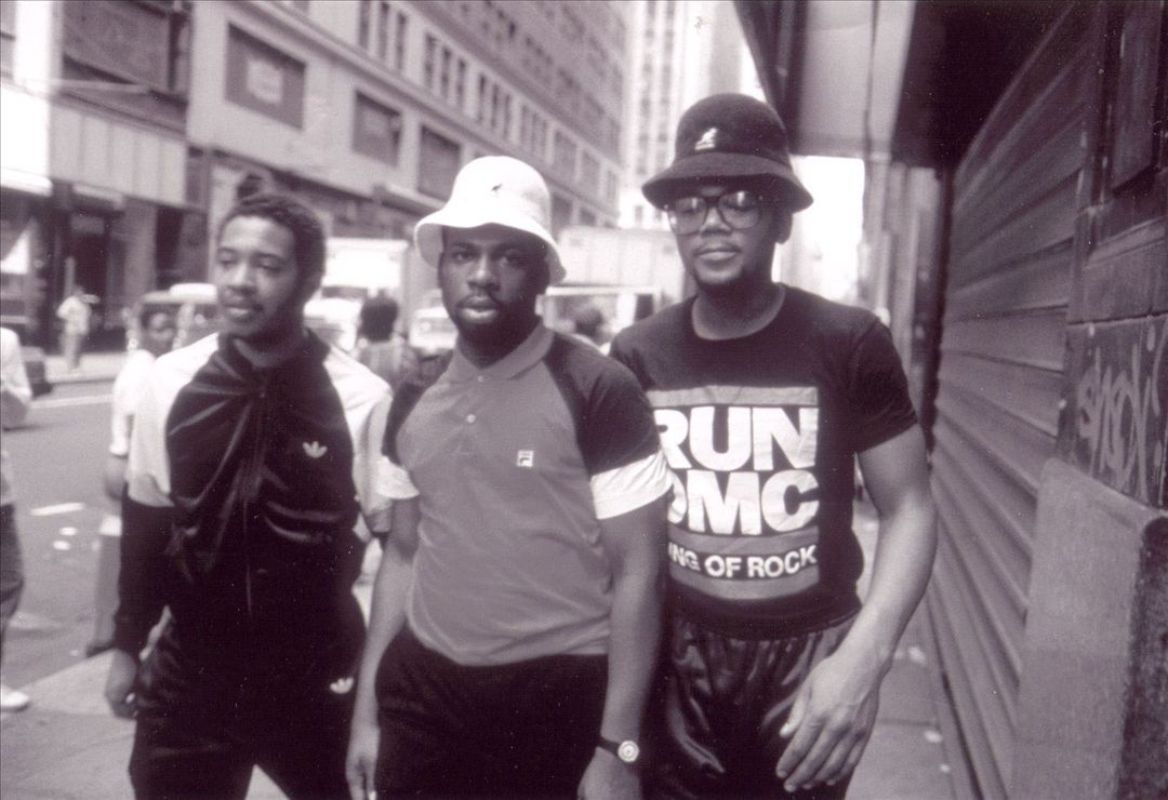
Hats, jackets, shell-toes, and chains. Run-DMC presented a striking and memorable image that resonated with America when they started releasing music in 1983. A group with such a focused identity clearly needed a logo to match. It took a few albums but they finally got one in the form of two thick red lines and six chunky letters set in Franklin Gothic Heavy — a simple visual shorthand for 80's hip-hop cool that's been remixed and rehashed as much as Milton Glaser's classic I ♥ NY campaign.
Strangely enough, the logo never appeared on a proper studio album—only singles and compilations. It did, however, appear in the background of the "Walk This Way" video, which dominated the airwaves in 1986 and successfully planted the image squarely in the public's consciousness.
The mark was designed by Stephanie Nash, an in-house designer for Island Records. It was commissioned by Ashley Newton, then the head of A&R and now the CEO of Columbia, and first appeared on the single for "My Adidas" (b/w "Peter Piper") off 1986's Raising Hell.
Raising Hell positioned Run-DMC firmly in the mainstream. It the first rap album to hit No. 1 on Billboard's Top R&B Albums chart, and peaked at No. 6 on the Billboard 200. In addition to "My Adidas," Raising Hell also features "Walk This Way" with Steven Tyler and Joe Perry of Aerosmith, the first rap song to reach the top 5 of The Billboard Hot 100. No small feat for a couple dudes from Hollis, Queens.
Raising Hell from 1986
The first print appearance of the logo.
Nash is now co-principal of Michael Nash Associates, a design studio in London. She spoke to Red Bull Music Academy's Sue Apfelbaum in an excellent 2013 interview that finally solved the mystery of who designed this logo (and a few others). Without Sue's incredible research and effort, this post simply wouldn't exist, and Stephanie's work would remain entirely uncredited. Speaking with Apfelbaum, Nash remembers her inspiration: “...listening [to the music], and thinking how visually typographic it was. Rap was very inspirational for me at that time: large, meaningful, hard-hitting words used with such power that I had not heard before."
“Rap was very inspirational for me at that time: large, meaningful, hard-hitting words used with such power that I had not heard before.”
"At the time we had a limited number of fonts available, and Franklin Gothic was ‘tough’ and forthright without being old-fashioned or faddish. [It’s a] good, solid, no-nonsense font. Run-DMC’s name helped in having two sets of three letters."
Franklin Gothic type specimen.
Franklin Gothic and its related faces are realist sans-serif typefaces created by Morris Fuller Benton (1872–1948) in 1902. It draws upon earlier, nineteenth century models, particularly Berthold's Akzidenz Grotesk. The faces were issued over a period of ten years, all of which were designed by Benton and issued by American Type Founders. Coincidentally, it was named in honor of a prolific American printer and modern rap lyric mainstay, Benjamin Franklin.
“Franklin Gothic [is] ‘tough’ and forthright without being old-fashioned or faddish... a good, solid, no-nonsense font.”
But more than the group's name or the typeface she used, Nash attributes the power of the mark to the group itself. "If the same graphic had been done for a pop band, it would not have acquired the same kudos.” 💯
Cey Adams, graffiti artist and designer, did the hand-lettering on Run-DMC’s self-titled debut (1984). He is often mistakenly given credit for Nash's mark.
King of Rock from 1984, also designed by Stephanie Nash.
Nothing is more Run-DMC than unlaced Adidas shell-toes.
Just a few of the many parodies the logo has inspired.
